One of the biggest misconceptions in interior design is that a room has to be large to feel spacious. It doesn’t. Some of the most inviting homes are surprisingly compact, while rooms twice the size can feel cramped and uncomfortable. The difference is rarely the floor plan alone; it is how the space is arranged and what the eye notices first.
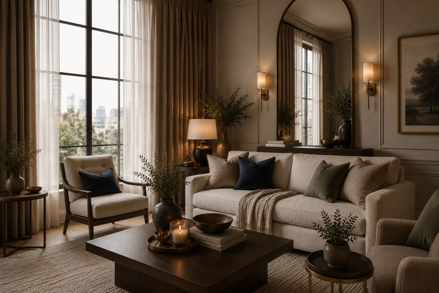
A close look at the room above reveals several simple techniques that maximize the sense of space. The curtains draw the eye upward, the oversized mirror adds depth, the low-profile sofa leaves more of the wall visible, and the layered lighting keeps darker areas from feeling closed in.
This article breaks down these design details one by one to explain exactly why they work, offering actionable inspiration to transform any home without the need to knock down walls or begin a major renovation.
Floor-to-Ceiling Curtains Create the Illusion of Height
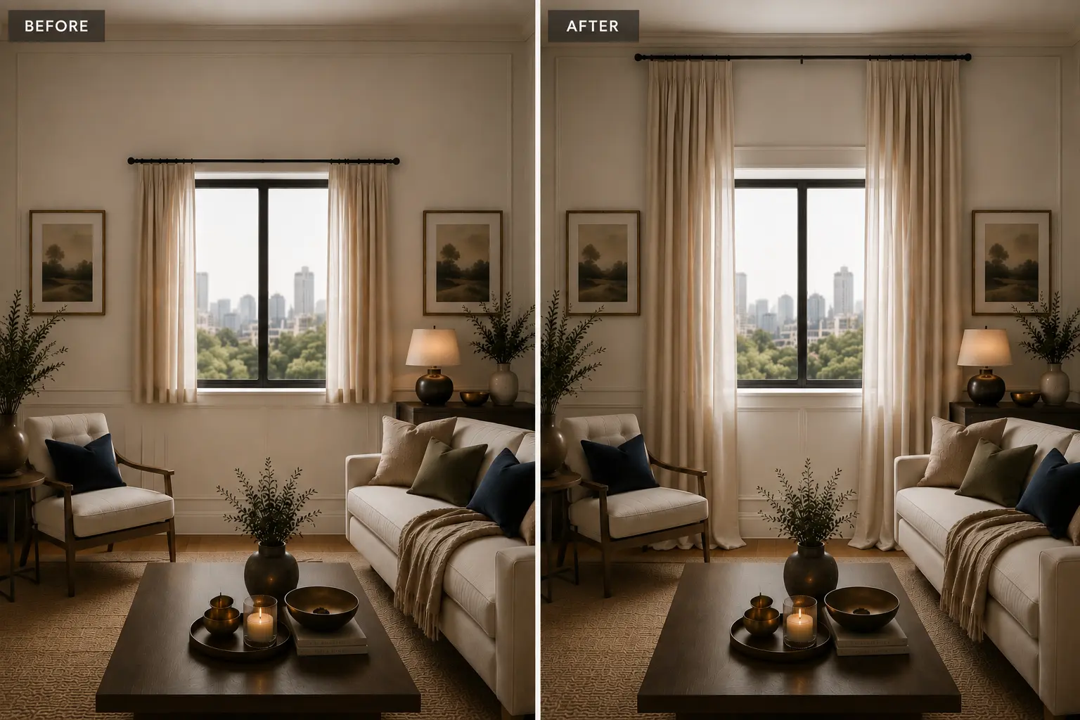
Look at the curtains in the room above. The rod sits close to the ceiling rather than directly above the window, which draws the eye upward and makes the walls appear taller. The curtains also extend all the way to the floor, creating one long vertical line instead of stopping partway down the wall.
Notice how the curtain rod extends beyond the window as well. When the curtains are pulled back, most of the glass remains visible, allowing more natural light into the room and keeping the window from feeling boxed in. The light fabric also keeps the window area from looking heavy.
Common Mistake
A common mistake is mounting the curtain rod directly above the window frame or choosing curtains that end at the sill or just below it. Both choices break up the wall and can make the window and ceiling appear lower.
How to Recreate the Look
Mount the curtain rod as close to the ceiling as practical and choose panels that reach the floor. If space allows, extend the rod beyond both sides of the window so the curtains can sit beside the glass when open. For a similar look, choose a light-filtering fabric in a neutral colour.
Frame Your Windows
- Linen-blend floor-to-ceiling curtain panels for soft vertical lines that make the walls appear taller.
- Adjustable ceiling-mount curtain rod for positioning the panels close to the ceiling.
- Light-filtering sheer curtain panels for keeping the window bright while maintaining a light, airy appearance.

spaces
Happy
days ♡
An Oversized Mirror Extends the Room
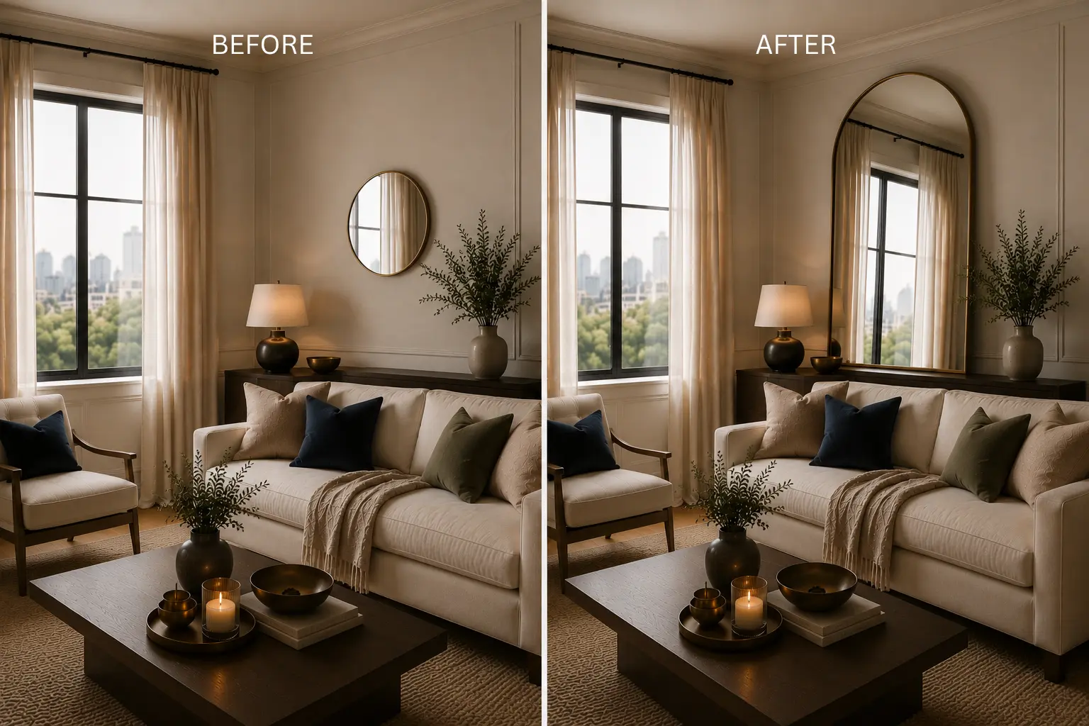
The large mirror on the right side of the featured room is another detail worth noticing. Instead of ending the view at a solid wall, the mirror reflects the window, curtains, and part of the room, giving the eye another view beyond the wall. That reflection can make the room feel deeper while also bringing more light into the space.
The size of the mirror matters too. A large mirror creates a much broader reflection than several small pieces, which can break the view into separate sections. In the room above, the simple frame also keeps the focus on the reflection rather than adding another busy element to the wall.
Common Mistake
One common mistake is choosing a mirror that’s too small for the wall. A tiny mirror can look lost above a large piece of furniture and won’t provide enough reflection to change how the room feels.
How to Recreate the Look
Choose the largest mirror that comfortably fits the wall and place it where it can reflect a window, natural light, or another attractive part of the room. Avoid positioning it where it reflects a blank wall, a doorway, or an area that you would rather not draw attention to.
Add Reflective Depth
- Oversized leaning floor mirror for creating a large reflective surface without requiring wall installation.
- Large arched wall mirror for adding height while reflecting more of the surrounding room.
- Minimal black-framed wall mirror for a simple architectural finish that keeps attention on the reflection.
A Low-Profile Sofa Keeps the Room Open
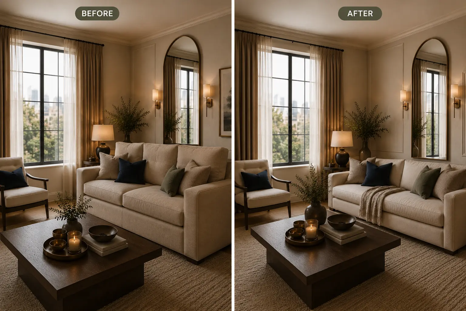
Notice how low the sofa sits compared with the height of the featured room. Its lower back leaves more of the wall visible, which helps the seating area feel lighter and keeps the room from looking dominated by one large piece of furniture.
Choosing smaller furniture isn’t always the answer. What matters is how much visual space each piece occupies. A sofa with a tall back, oversized arms, or a deep, boxy frame can feel heavy even when its overall footprint isn’t much larger than a lighter design. In the room above, the low sofa is balanced by the lighter accent chair, giving the seating area enough room to breathe.
Common Mistake
A common mistake is choosing furniture based only on whether it physically fits in the room. A sofa can fit comfortably within the measurements of a space and still make it feel cramped if its proportions are too bulky.
How to Choose
Look beyond the width and depth of a sofa. Pay attention to the height of the back, the size of the arms, the amount of visible floor underneath, and the overall shape. Lower backs, slimmer arms, exposed legs, and lighter upholstery can make a large sofa feel less dominant without sacrificing seating space.
Choose a Lighter Sofa
- Low-profile linen sofa for substantial seating without making the room feel visually heavy.
- Curved low-back sofa for a softer silhouette that keeps more of the wall visible above the furniture.
- Neutral accent chair with exposed legs for additional seating while allowing light and sightlines to pass underneath.
A Simple Coffee Table Creates More Breathing Room
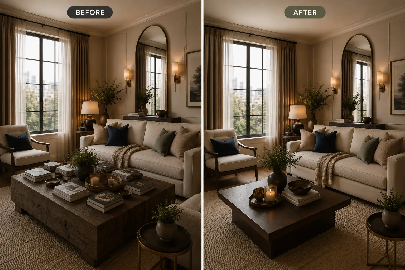
The coffee table in the featured image is a good example of how scale and open space work together. It’s substantial enough for the sofa and chairs, but there is still enough room around it to walk comfortably through the seating area. That space around the table is just as important as the table itself because a piece that’s too large can make the whole seating area feel cramped.
The table’s simple shape also helps. A clean design without bulky legs or unnecessary details keeps the centre of the room from feeling heavy. The dark wood adds contrast to the lighter furniture and rug without taking up more visual space than necessary.
Common Mistake
Coffee tables often become both too large and too full. A table that leaves very little space between itself and the sofa or chairs can make it difficult to move around the room. The surface can also become crowded with books, trays, and decorative objects, making the area feel busier than it needs to.
Get the Scale Right
Choose a coffee table that leaves comfortable space between the table and the surrounding seating. Before buying, measure the area and consider how people will move around it, not just whether the table physically fits. Keep the surface relatively open as well, so the centre of the room doesn’t become the first thing you notice.
Find the Right Coffee Table
- Solid wood pedestal coffee table for a substantial centrepiece without visually complicated legs.
- Low-profile coffee table tray for keeping everyday items contained without covering the entire tabletop.
BRING MORE GOOD IDEAS HOME
A little inspiration, delivered regularly.
Get thoughtful decorating ideas, practical home tips, and fresh inspiration in your inbox.
Weekly Inspiration. No Spam
Layered Lighting Adds Depth and Warmth
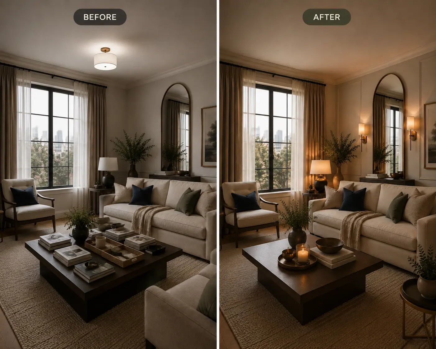
Look at how the featured room above uses more than one light source. Natural light enters through the windows, while the table lamp and wall sconces add light at lower levels. Instead of having one bright source illuminate everything from above, the room has light coming from different points, which creates softer shadows and keeps darker areas from feeling closed off.
The wall sconces also help draw attention to the mirror, while the table lamp gives the seating area a warmer glow. This combination makes the room easier to look around because your eye isn’t drawn to just one bright spot.
Common Mistake
A single overhead light may brighten the entire room, but it can leave corners looking dark and create harsh shadows. It also makes the lighting feel flat because everything is illuminated from the same height.
Create Layers of Light
Start with the main ceiling light or natural daylight, then add one or two lower light sources around the room. A table lamp beside the sofa or a pair of wall sconces can add light where you actually spend time. Use warm white bulbs, around 2700K, for a softer evening light.
Layer Your Lighting
- Ceramic table lamp for creating a warm pool of light beside the sofa or accent chair.
- Plug-in wall sconce for adding light at another height while keeping valuable floor space clear.
Simple Styling Keeps the Room Open
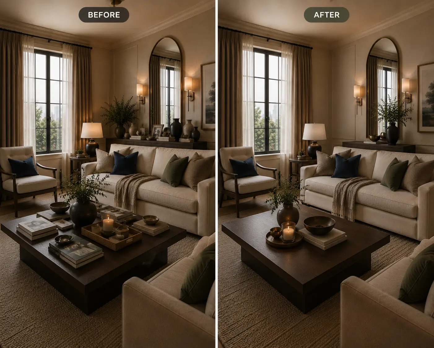
Look at the console behind the sofa and the coffee table in the featured image above. Both surfaces have a few decorative pieces, but neither is completely filled. Leaving some open space keeps the eye moving around the room instead of stopping at a collection of objects on every surface.
The same approach works on shelves, side tables, media consoles, and kitchen counters. You don’t need to remove every decorative piece. Instead, group a few items together and leave some of the surface visible around them.
Common Mistake
It’s easy to keep adding one more vase, candle, book, or decorative object until every surface is full. Even when the individual pieces are attractive, too many of them can make a room feel busy and take away from the sense of space you’re trying to create.
A Simple Styling Formula
Start with one larger piece, such as a vase or bowl, then add one or two smaller objects such as a candle or a few books. Group them together rather than spreading small decorations across the entire surface. Leave part of the table, console, or shelf empty so the arrangement doesn’t take over the room.
Travertine decorative tray for grouping a few objects together while keeping the rest of the surface clear.
Keep Your Surfaces Light
- Handmade ceramic bud vase for adding a small sculptural element without taking over the arrangement.
- Stone candle holder for introducing a warm accent while keeping the styling restrained.
The Bottom Line
A room doesn’t have to be bigger to feel bigger. The right curtain placement can draw the eye upward, a large mirror can add depth, and furniture with lighter proportions can leave more of the room visible. Even smaller details, such as the amount of space around a coffee table or the way a room is lit, can change how open the space feels.
You don’t need to use all six ideas at once. Start with the part of your room that feels most cramped and make one change at a time. A higher curtain rod, a larger mirror, or a better-scaled piece of furniture may be enough to make the entire room feel noticeably more spacious.
RELATED ARTICLES