Colour has the power to completely change the way a home feels. The right combination can make a room feel warmer, calmer, brighter, and more refined, even when the furniture and layout stay exactly the same.
These nine palettes show how different colours can work together to create a home that feels polished without looking overly matched.
Quiet Luxury
Think hushed hotel suites, rich textures, and effortless elegance.
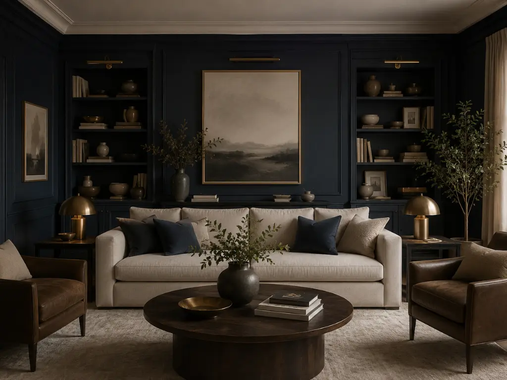
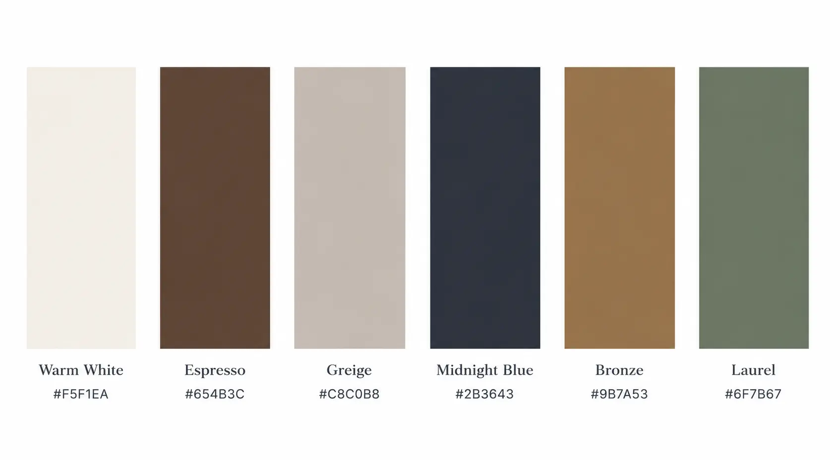
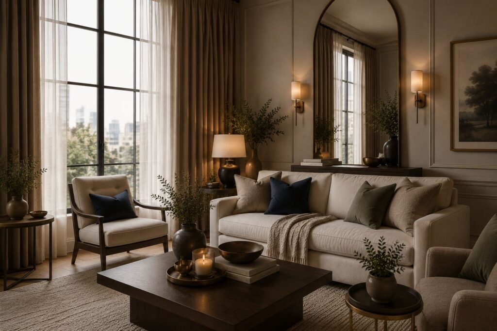
This palette balances soft neutrals with rich, grounding tones to create a home that feels warm, refined, and timeless.
Warm white and greige keep the overall look light, while espresso, midnight blue, bronze, and laurel introduce richer points of contrast.
The darker colours don’t need to be used sparingly. A midnight blue wall, espresso furniture, or bronze lighting can become a major part of the room while the lighter shades keep everything from feeling too heavy.
For the best result, bring in materials with some natural variation rather than relying on perfectly smooth finishes. Linen, wool, wood, aged metal, and softly textured upholstery all work particularly well with this combination.
Perfect For
- Living Rooms
- Bedrooms
- Home Offices
- Dining Rooms
- Boutique Hotel–Inspired Spaces
Build the Foundation
Start with one substantial neutral or rich-toned piece, then let the smaller details pick up the bronze, espresso, or midnight-blue accents.
- Textured Wool Area Rug: Soft, layered texture in a warm neutral foundation.
- Linen Accent Chair: Relaxed upholstery that brings warmth without adding visual weight.
- Bronze Table Lamp: Aged-metal finish for a deeper, more refined accent.

spaces
Happy
days ♡
Parisian Modern
Soft, romantic, and effortlessly chic.
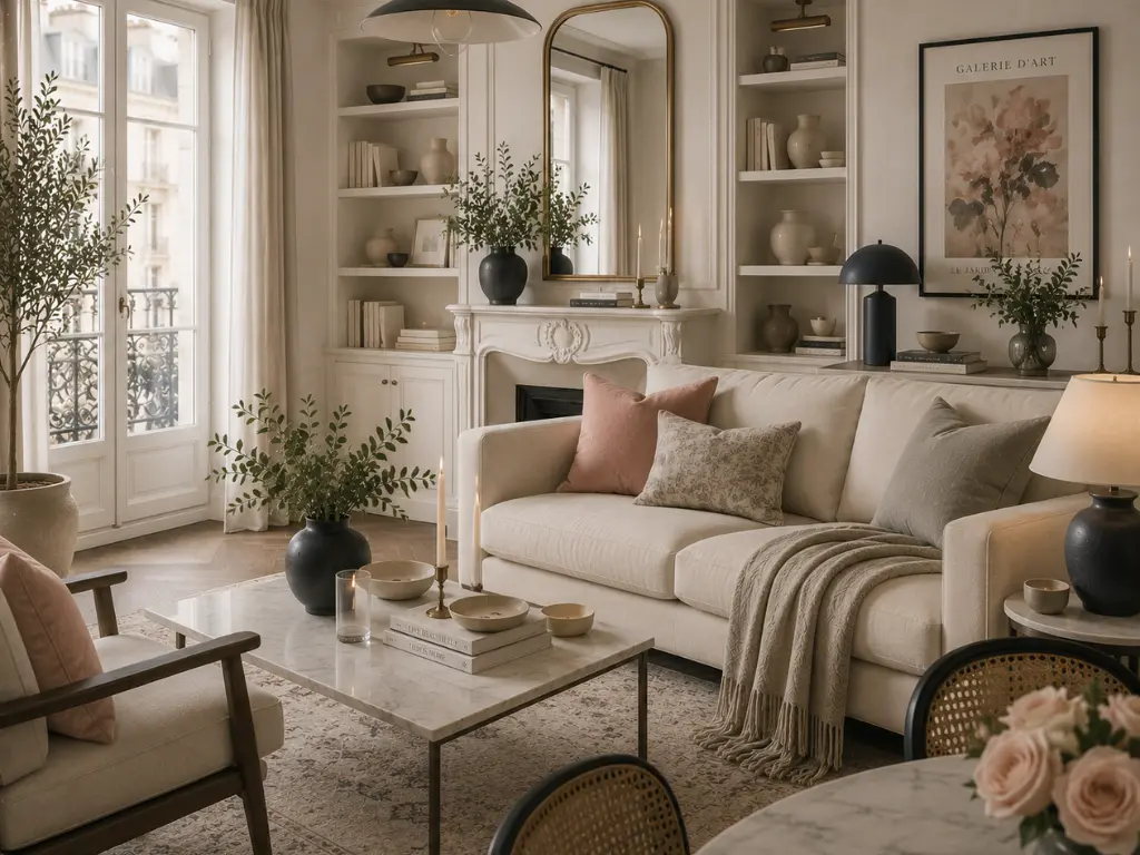
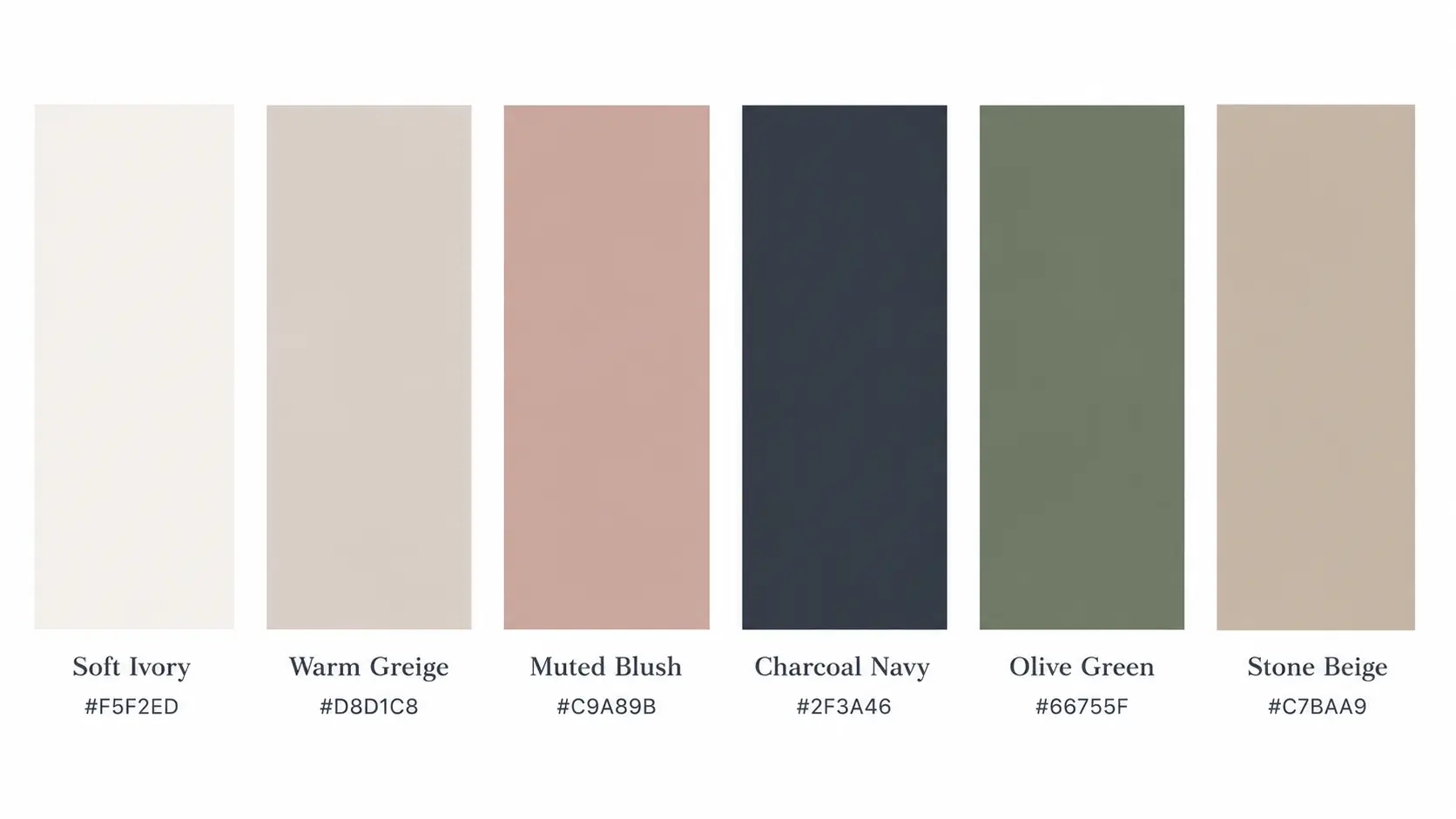
This palette pairs warm neutrals with muted, elegant accents to create a home that feels bright, graceful, and inviting. Soft ivory and warm greige provide a calm foundation, while muted blush, charcoal navy, olive green, and stone beige give the room personality without making the colour scheme feel busy.
The combination works especially well when the softer colours are allowed to appear on larger pieces such as upholstered furniture, bedding, curtains, or even walls rather than being limited to small accessories.
Natural linen, painted wood, aged brass, and softly finished ceramics complement the palette beautifully. In rooms with strong natural light, the blush and ivory tones feel particularly fresh, while warmer evening lighting brings out the beige and muted undertones.
Perfect For
- Living Rooms
- Bedrooms
- Reading Nooks
Introduce Soft Colour Through Fabric
Use blush, ivory, olive, or stone beige on larger textiles rather than scattering small decorative accents around the room.
- Washed Linen Bedding Set: Soft ivory or muted blush for an understated bedroom layer.
- Upholstered Accent Chair: A muted blush, olive, or stone-beige finish adds colour without dominating the room.
- Linen Curtain Panels: Warm neutral fabric that keeps the palette light and relaxed.
Organic Modern
Earthy, textural, and grounded in natural materials.
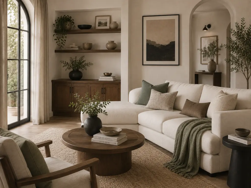
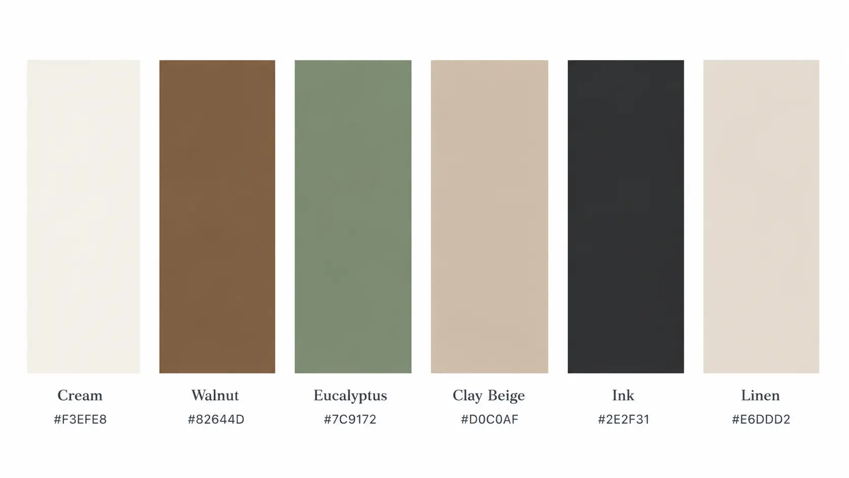
This palette layers warm earth tones with soft neutrals to create a calm, welcoming atmosphere inspired by nature.
Cream and linen keep the combination light, while walnut, eucalyptus, and clay beige add warmth and depth. Ink provides a darker contrast that can be used to give furniture, lighting, or artwork more definition without taking away from the natural feel of the palette.
This combination comes alive through materials as much as colour. Walnut furniture, linen upholstery, woven fibres, handmade ceramics, and natural stone all reinforce the earthy character of the palette.
If the room already contains plenty of wood, softer textiles and muted green accents can add enough variation without introducing another strong colour.
Perfect For
- Living Rooms
- Bedrooms
- Entryways
- Dining Rooms
- Home Offices
Start with Natural Materials
Let walnut, linen, and handmade ceramics establish the palette before adding smaller eucalyptus and clay-toned accents.
- Walnut-Tone Side Table: Rich wood grain that anchors the warmer side of the palette.
- Linen Throw Blanket: A soft natural layer that breaks up harder wood surfaces.
- Handmade Ceramic Vase: An earthy clay-toned accent with an irregular finish.
Coastal European
Relaxed, airy, and effortlessly polished.
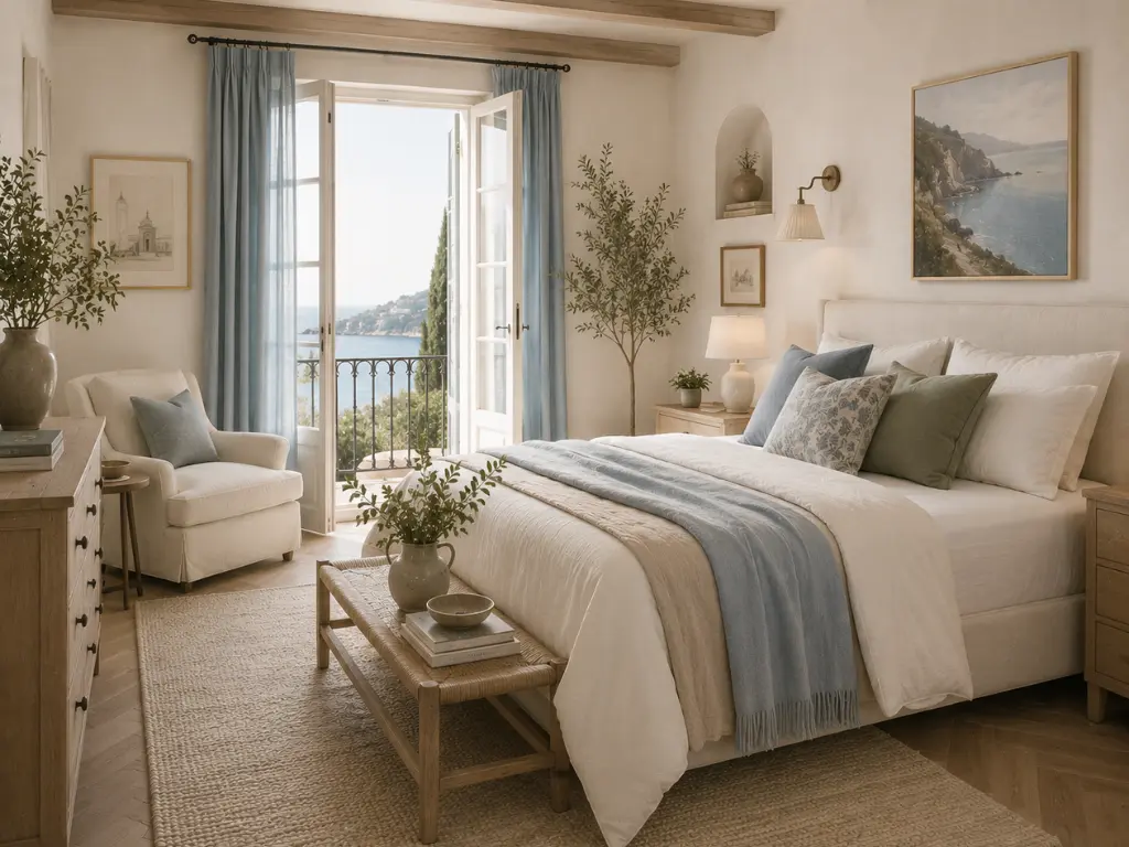
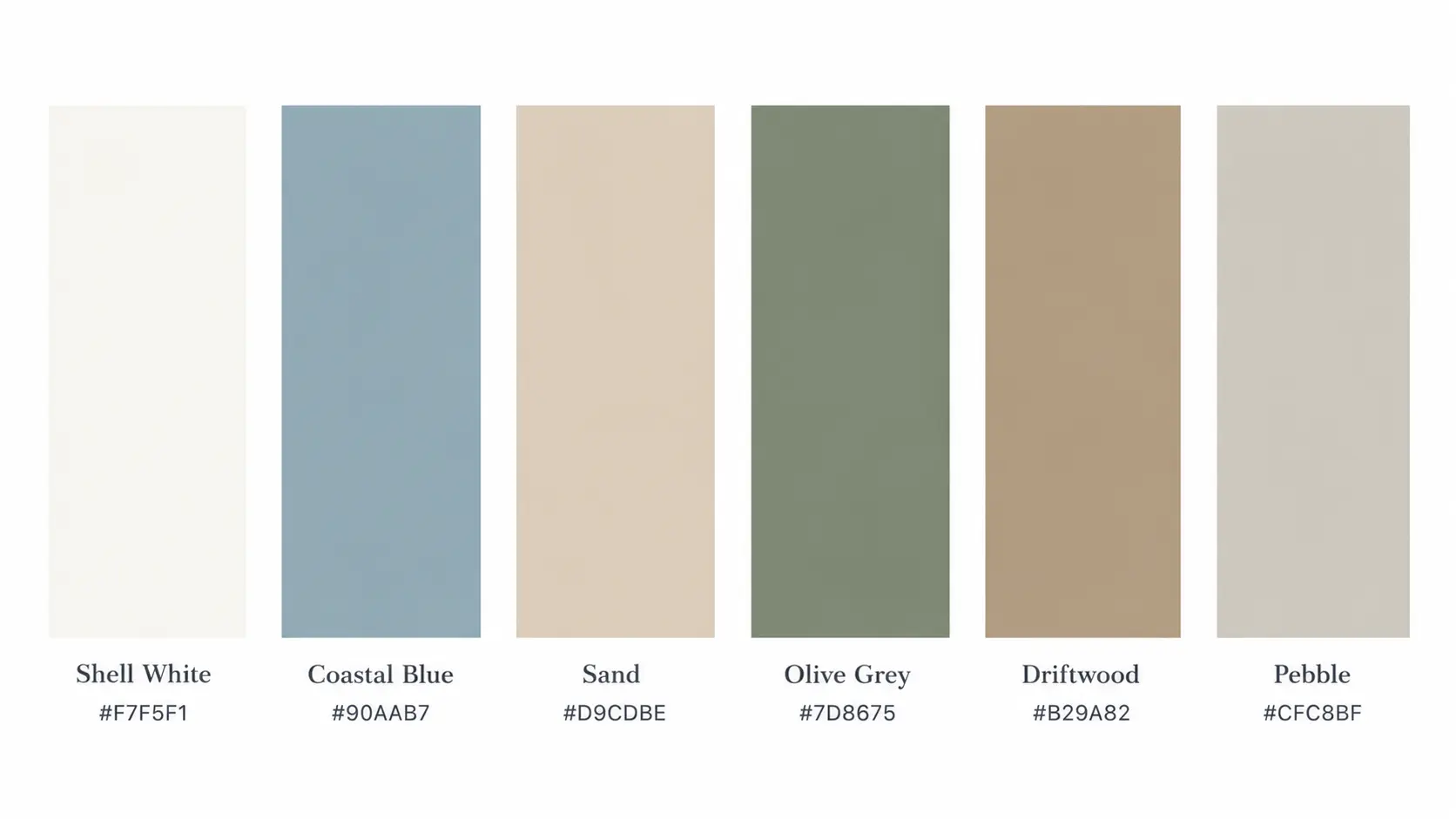
This palette combines soft coastal hues with warm neutrals to create spaces that feel fresh, open, and quietly elegant. Shell white and sand keep the overall look light, while coastal blue, olive grey, driftwood, and pebble bring in the softer, weathered tones that give the palette its character.
The colours work particularly well when they’re allowed to appear across larger elements of the room rather than being restricted to small decorative accents.
Linen, light wood, woven textures, ceramic, and natural stone all complement this palette without making it feel overly beach-themed. The result is coastal without relying on obvious nautical decoration, which makes it versatile enough for everyday living spaces.
Perfect For
- Bedrooms
- Kitchens
- Dining Rooms
- Sunrooms
- Bathrooms
Add Weathered Coastal Tones
Bring in the blue, sand, and driftwood shades through textiles and everyday pieces rather than obvious nautical decoration.
- Coastal Blue Runner Rug: A muted blue foundation that introduces colour without looking beach-themed.
- Natural Linen Curtains: Soft fabric in shell white or sand for an airy finish.
- Light Ceramic Dinnerware Set: Simple stone or ivory tones that suit everyday dining.
Moody Botanical
Deep, earthy, and a little dramatic
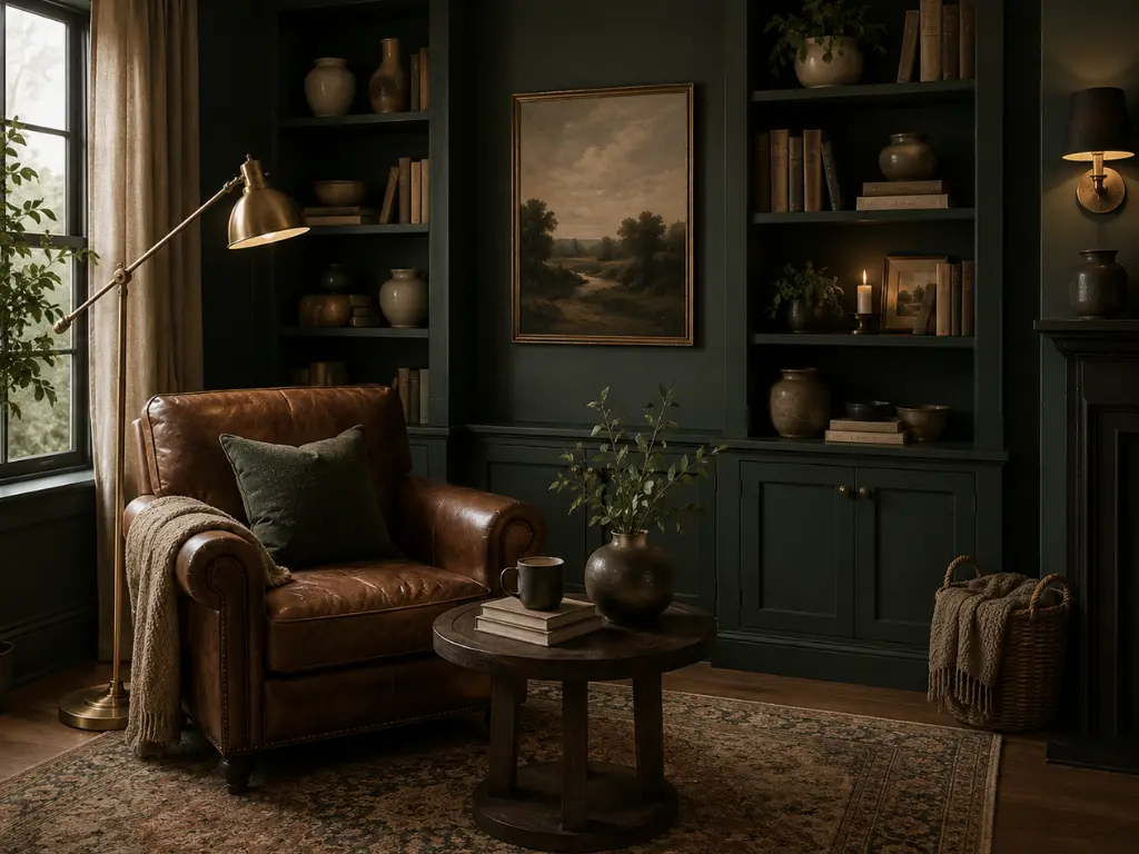
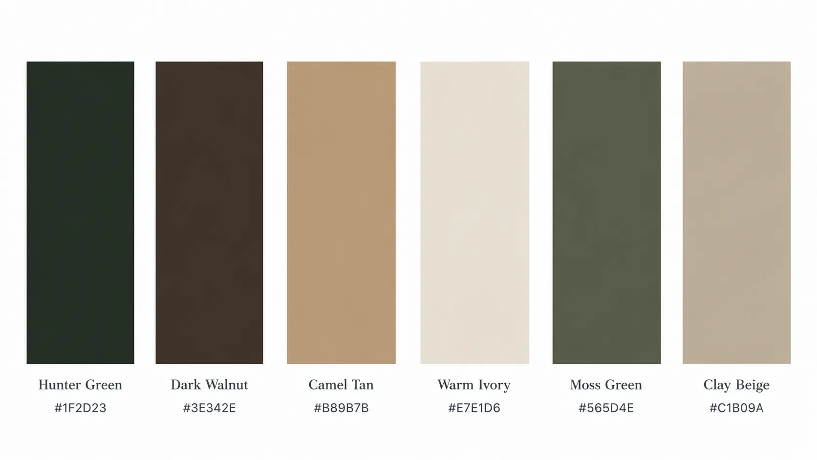
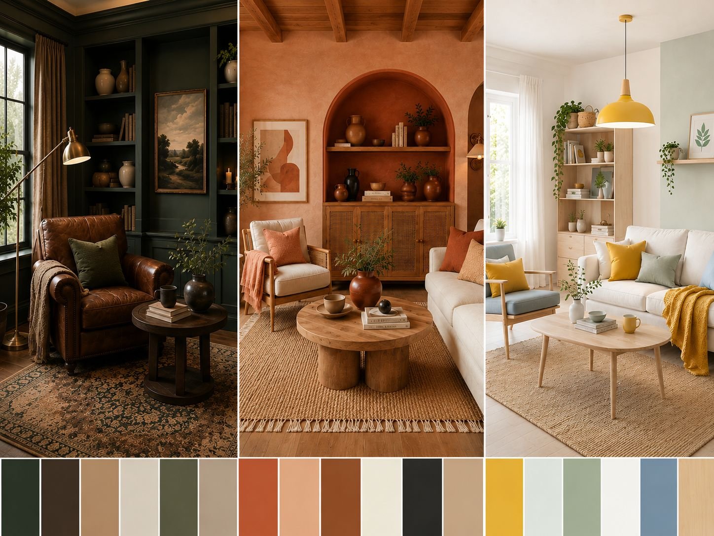
This palette blends rich, nature-inspired colours with warm neutrals to create depth without making a room feel dark. Hunter green and dark walnut give the combination its strongest character, while camel tan, warm ivory, moss green, and clay beige soften the deeper shades and keep the room from feeling too heavy.
The palette can be especially striking when a deeper colour is allowed to take up significant visual space rather than being used only in small accessories.
The natural quality of the colours makes this combination particularly suited to wood, linen, wool, leather, aged metal, and botanical textures. Warm lighting also works beautifully here, bringing out the richness of the greens and browns once daylight fades.
Perfect For
- Living Rooms
- Dining Rooms
- Home Libraries
- Home Office
Deepen the Room with Green
A single substantial green piece can establish the palette far more effectively than a collection of small green accessories.
- Moss Green Lounge Chair: A rich upholstered anchor for the deeper botanical tones.
- Wool Throw Blanket: Warm camel, moss, or olive for a softer layer.
- Warm-Toned Floor Lamp: Low, warm illumination that brings out the depth in walnut and green.
BRING MORE GOOD IDEAS HOME
A little inspiration, delivered regularly.
Get thoughtful decorating ideas, practical home tips, and fresh inspiration in your inbox.
Weekly Inspiration. No Spam
Terracotta Modern
Warm, sun-baked, and beautifully grounded.
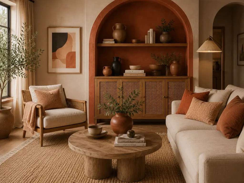
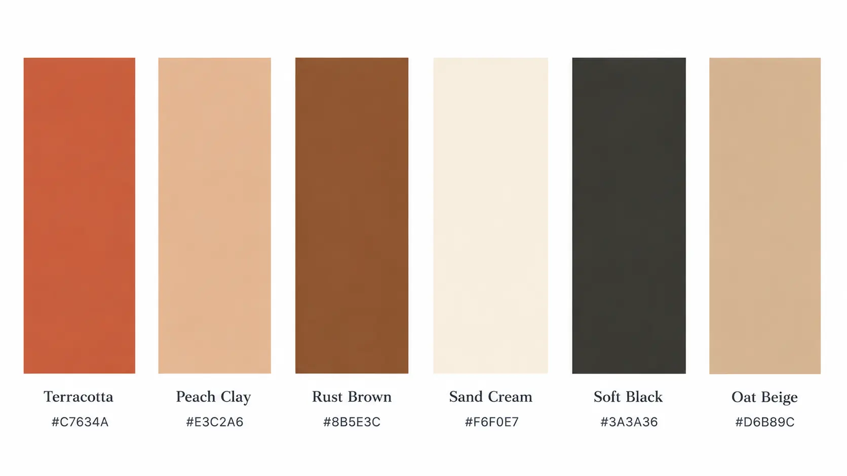
This palette combines earthy terracotta with soft neutrals and natural accents to create spaces full of warmth and character.
Terracotta and rust brown bring the strongest warmth to the combination, while peach clay, sand cream, and oat beige soften the overall look. Soft black provides contrast and gives the warmer colours a more modern edge.
The palette works particularly well with materials that have visible texture or variation, including natural wood, linen, ceramic, stone, and woven fibres.
Terracotta can be especially effective when used beyond small accessories, whether through a painted wall, upholstered furniture, a large rug, or substantial ceramics. That gives the palette enough presence to feel like a design choice rather than a collection of orange accents.
Perfect For
- Living Rooms
- Kitchens
- Covered Patios
- Outdoor Dining Areas
Bring in Sun-Baked Colour
Use terracotta on substantial textiles, ceramics, or furniture rather than limiting it to tiny decorative accents.
- Terracotta Linen Tablecloth: An easy way to bring the warm clay tone into dining spaces.
- Textured Area Rug: Sand, oat, and rust tones create a larger colour foundation.
- Handmade Ceramic Serving Bowl: A substantial terracotta or rust-toned piece for the kitchen or dining table.
Sunny Scandinavian
Bright, cheerful, and full of energy without feeling loud.
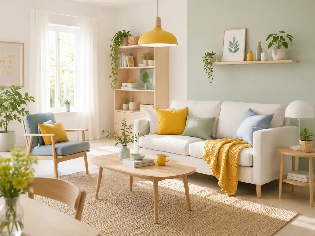
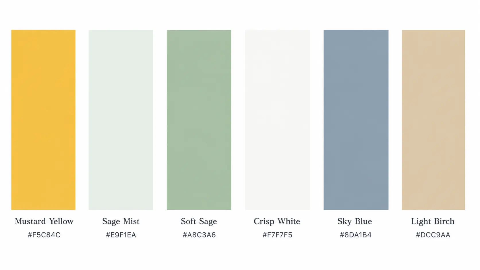
This palette pairs clean neutrals with soft, uplifting colours to create spaces that feel light, fresh, and welcoming.
Mustard yellow and sky blue bring personality to the combination, while sage mist, soft sage, crisp white, and light birch keep it feeling balanced rather than overly colourful. The result is cheerful without becoming childish, making it particularly easy to adapt to everyday spaces.
Light woods, simple ceramics, linen, cotton, and softly textured fabrics fit naturally with this palette. Plenty of natural light brings out the freshness of the lighter colours, while warmer bulbs in the evening keep the whites and pale greens from feeling too cool.
Perfect For
- Living Rooms
- Kitchens
- Breakfast Nooks
- Entryways
- Reading Nooks
Test One Bright Accent
Choose mustard, sky blue, or soft sage for one noticeable piece and allow the surrounding whites and pale woods to keep it balanced.
- Mustard Yellow Accent Cushion: A small dose of warm colour against crisp white or pale upholstery.
- Sky Blue Bench: A stronger colour block that works particularly well in an entryway or breakfast nook.
- Soft Sage Throw Blanket: A quieter green layer for balancing the brighter accents.
Soft Modern Luxe
Elegant, feminine, and wonderfully calming.
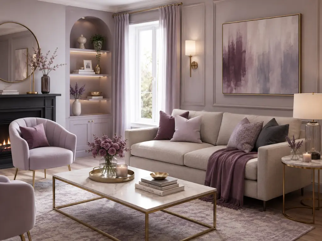
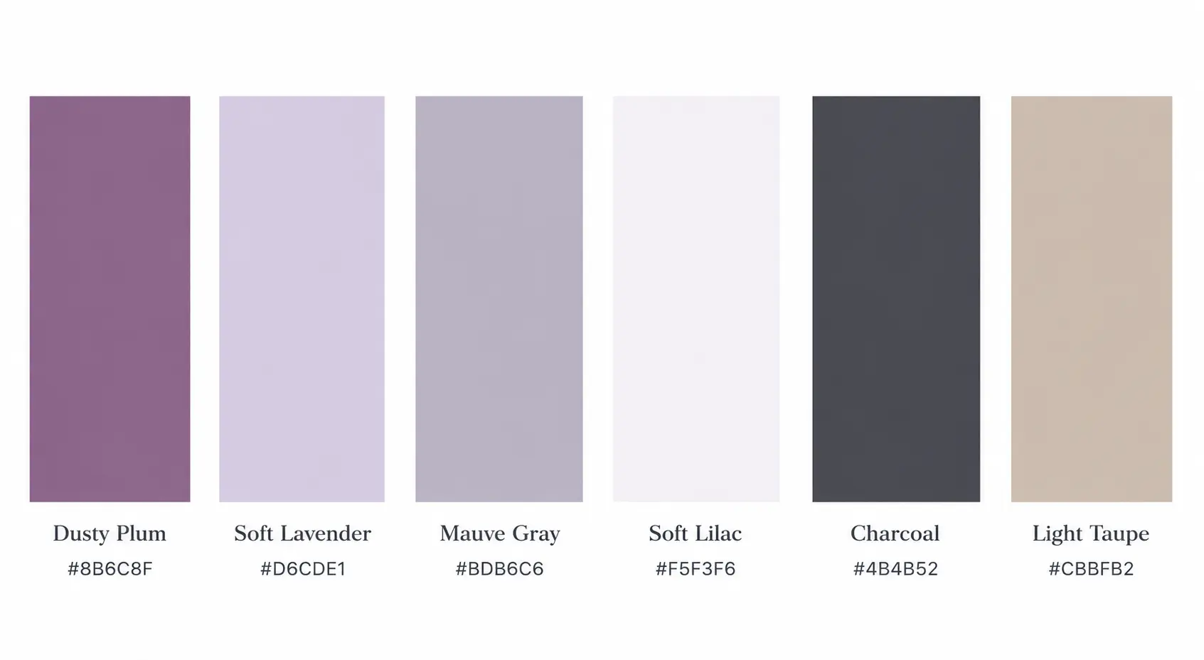
This palette layers delicate neutrals with soft accent colours to create a refined yet comfortable atmosphere.
Dusty plum and soft lavender give the combination its personality, while mauve grey, soft lilac, light taupe, and charcoal provide enough variation to keep the room from feeling overly sweet.
The deeper plum and charcoal tones can also add contrast, making the palette feel sophisticated rather than simply pastel.
Velvet, linen, boucle, brushed metal, and softly upholstered furniture work particularly well here because they add depth to the pale colours. The palette is especially beautiful under warm evening lighting, which brings out the richer mauve and plum tones.
Perfect For
- Living Rooms
- Bedrooms
- Dressing Rooms
- Ensuite Bathrooms
Layer the Softer Tones
Bedding and upholstery are the easiest places to introduce mauve, lavender, plum, and taupe without making the room feel overly pastel.
- Mauve Linen Bedding Set: Muted colour with enough depth to feel sophisticated.
- Upholstered Accent Bench: Soft mauve, lavender, or taupe for the end of a bed or dressing area.
- Full-Length Framed Mirror: A substantial reflective piece that adds presence without introducing another strong colour.
Warm & Cozy Living
Comfortable, timeless, and naturally inviting.
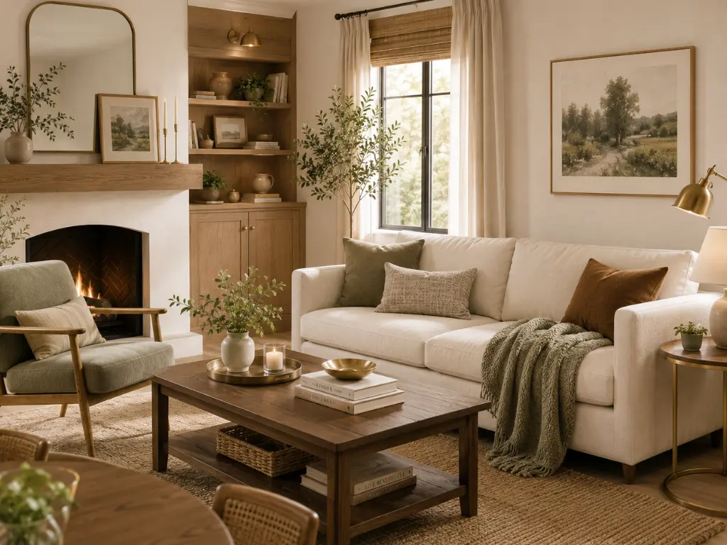
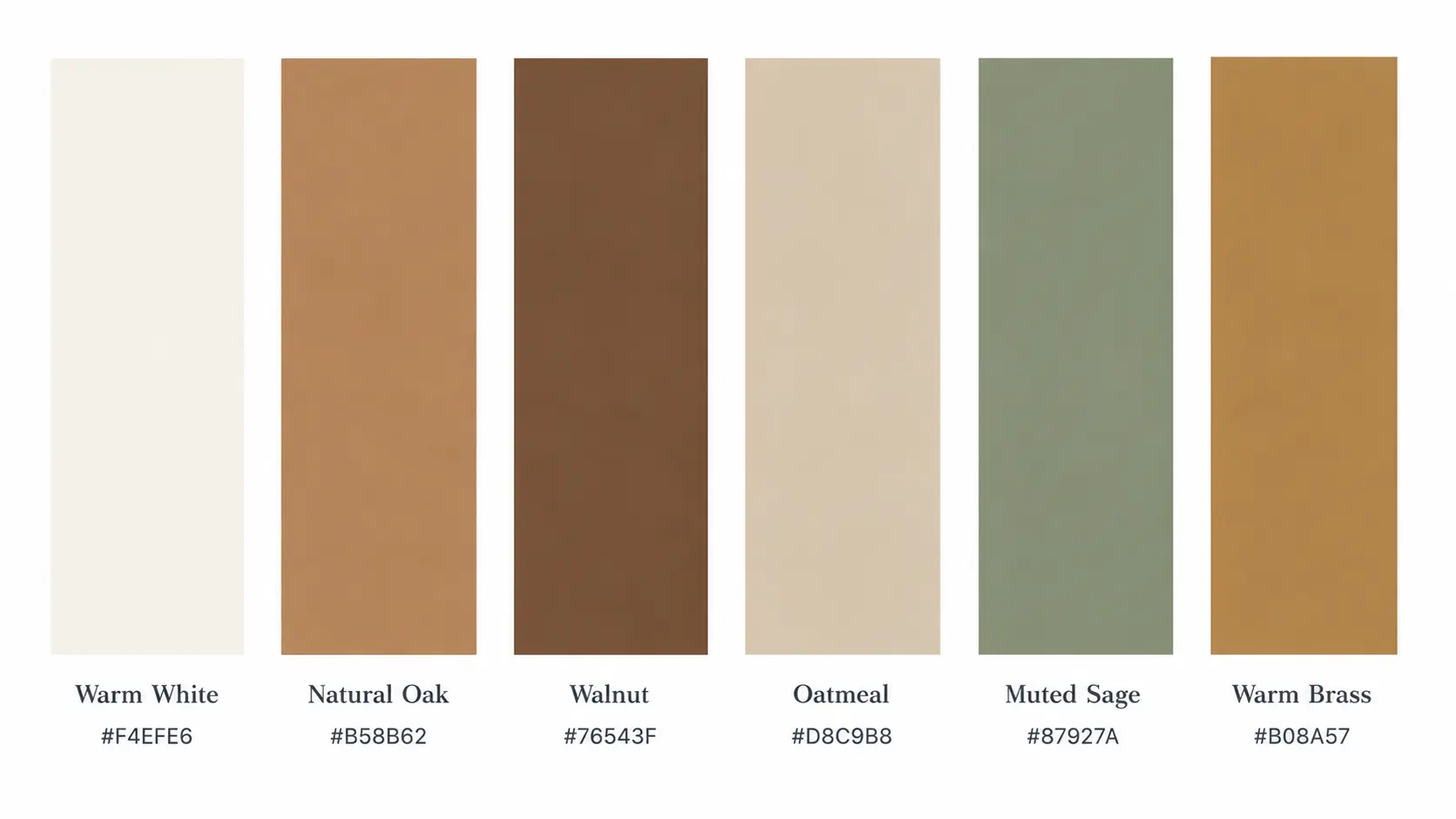
This palette combines warm neutrals, natural wood tones, and soft earthy accents to create a home that feels welcoming in every season.
Warm white and oatmeal keep the room soft and comfortable, while natural oak and walnut introduce warmth through the furniture and architectural details.
Muted sage adds a subtle connection to nature, while warm brass gives the combination a small touch of richness without making it feel formal.
This is a palette where texture matters as much as colour. Linen curtains, wool rugs, woven baskets, boucle upholstery, and natural wood can make the room feel layered without relying on lots of decoration. It also works beautifully with warm, diffused lighting, particularly in living rooms and bedrooms where comfort matters most.
Perfect For
- Living Rooms
- Bedrooms
- Family Rooms
- Reading Nooks
Warm Up Existing Neutrals
If your furniture is already neutral, introduce oak, wool, linen, and muted sage instead of replacing the entire room.
- Wool Area Rug: A warm neutral foundation with enough texture to soften the room.
- Linen Curtain Panels: Lightweight fabric in oatmeal, warm white, or natural flax.
- Oak Coffee Table: Natural wood that brings the palette’s warmth into the centre of the room.
Choosing a Palette for Your Home
You don’t need to follow any of these palettes exactly. Use them as starting points and adapt the colours to the furniture, flooring, finishes, and natural light already in your home.
Start by choosing the palette that comes closest to the atmosphere you want. Then select two or three main colours and let the remaining shades appear in smaller details such as textiles, artwork, lighting, or accessories.
If you’re drawn to Parisian Modern, Coastal European or Soft Modern Luxe, keep the overall look soft and understated. For something warmer, Organic Modern, Terracotta Modern, or Warm & Cozy Living offer more earthy colour. Quiet Luxury and Moody Botanical brings deeper contrast, while Sunny Scandinavian feels lighter and more energetic.
A Note About the Colour References
The colours shown in these palettes are digital references, not exact paint matches. The same shade can look different on a real wall depending on natural light, artificial lighting, surrounding colours, and paint finish.
If you want to use one of these colours on your walls, look for a similar shade from an established paint brand and test a physical sample in your room first. Check it during the day and again in the evening before committing to the full colour.
Test Before You Paint
- Peel-and-Stick Paint Samples: Moveable samples for testing colours around the room.
- Paint Sample Cards: Several nearby shades for comparing undertones.
- Repositionable Sample Sheets: Useful for checking a colour against existing finishes in different light.
The Bottom Line
A home doesn’t need a complicated colour scheme to feel polished. Choose a small group of colours you genuinely like, consider what is already in the room, and repeat those shades naturally throughout the space.
The goal isn’t to make every room look identical. It’s to give the home a sense of colour connection from one room to the next.
RELATED ARTICLES