A home doesn’t need soaring ceilings, enormous rooms, or designer furniture to feel expensive.
Walk into a beautifully designed boutique suite and you’ll notice that the sense of luxury often comes from something subtler: the proportions feel intentional, materials repeat naturally, windows look taller, furniture doesn’t overwhelm the floor, and even the smallest details appear carefully chosen.
The same principles can work in a modest home.
Luxury is less about how much space you have and more about how deliberately you use it. Strategic scale, visual continuity, reflected light, substantial materials, and carefully selected finishes can make a small home feel considerably more polished without requiring a major renovation.
These seven design tricks focus on the visual and physical details that have the greatest impact, helping you create a home that feels refined without making it feel crowded.
Commit to a Consistent Whole-Home Color Palette
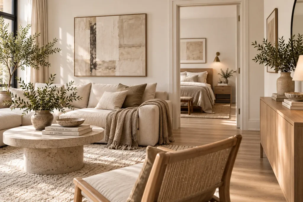
One of the quickest ways to make a small home feel visually fragmented is to give every room a completely different colour story.
When each space introduces unrelated colours, finishes, and decorative tones, the eye has to constantly adjust as you move through the home. In a compact footprint, that can make the rooms feel even more disconnected and visually busy.
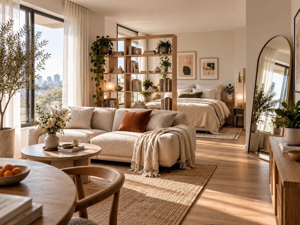
Instead, choose a restrained palette that can travel throughout the home. Start with two or three foundational colours, then repeat them in different proportions across your living room, bedroom, hallway, and other spaces.
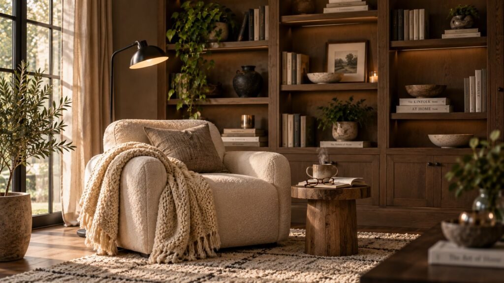
For example, warm white walls might connect with beige textiles, natural wood, and muted stone throughout the home. You don’t need to use the exact same shades everywhere. What matters is that the colours feel like they belong to the same visual family.
If you’re building a cohesive palette from room to room, our guide to color combinations that make any home feel more expensive offers more ideas for pairing complementary shades.
This continuity creates a subtle optical effect: the boundaries between rooms become less noticeable, making the entire home feel more cohesive and considered.
Don’t confuse consistency with matching. A refined home can still have plenty of personality. The trick is to let a limited colour vocabulary create the underlying connection.
Build a Refined Colour Palette
- Neutral abstract canvas set: introduces artwork while keeping the same restrained tones moving through the home.
- Belgian linen pillow covers: repeat soft neutral colours through the seating areas.
- Hand-tufted wool area rug: reinforces the foundational palette while adding depth underfoot.
- Neutral peel-and-stick paint samples: make it easier to test warm and cool undertones before committing to a wall colour.
spaces
Happy
days ♡
Target Visual Scaling with Oversized Statement Pieces
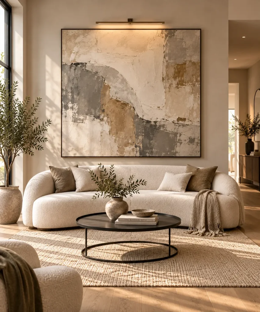
Small homes often create a strange decorating temptation: because the room is small, you assume everything inside it should also be small.
That usually leads to the opposite result.
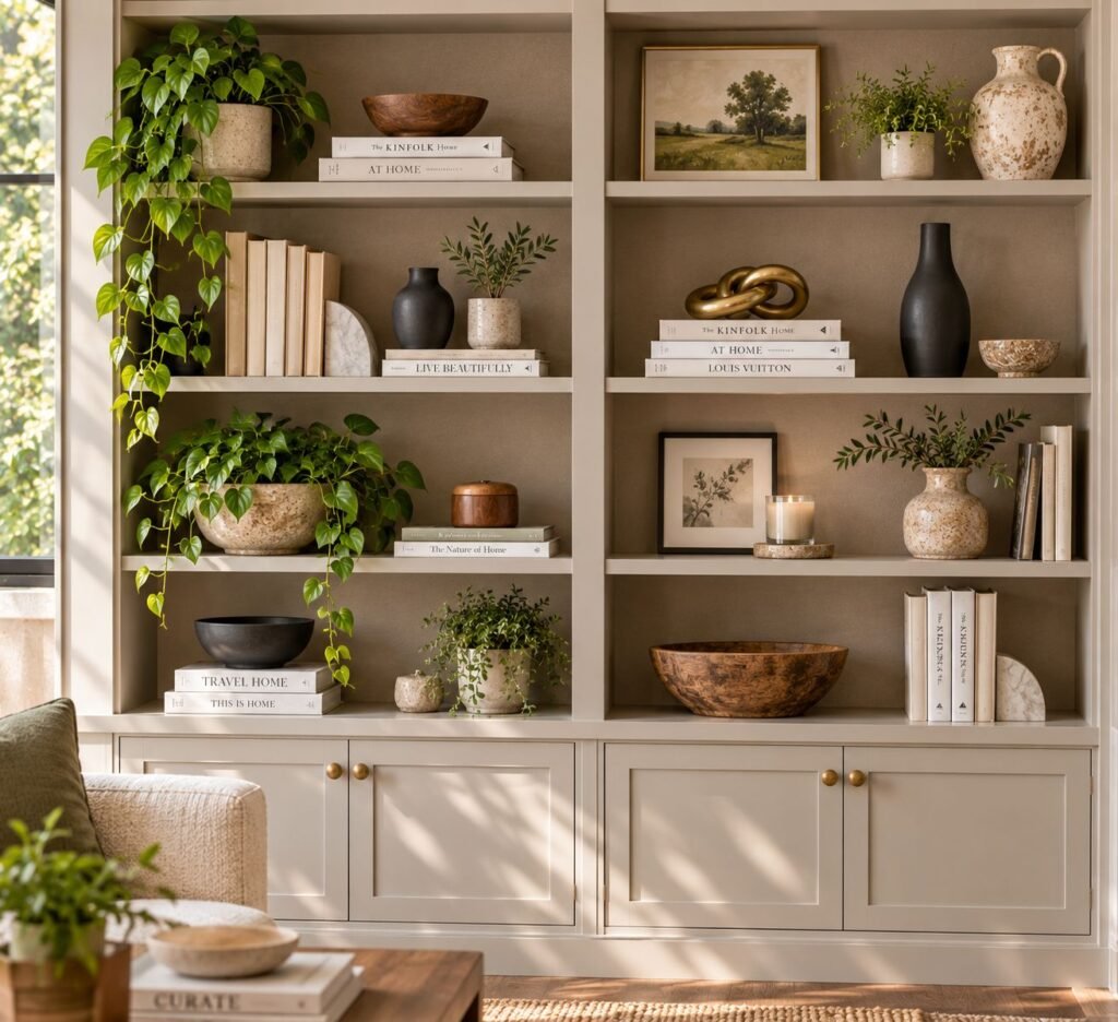
A collection of tiny tables, miniature lamps, small artwork, and scattered decorative objects can make a room feel fragmented and cluttered. Instead of creating the impression of more space, all those small pieces give the eye dozens of individual elements to process.
Try using one or two substantial pieces instead.
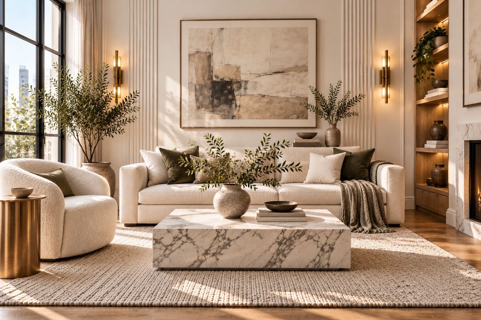
A low-slung curved sofa, a generously scaled coffee table, an oversized artwork, or a sculptural light fixture can give the room a clear visual anchor. Because there are fewer competing objects, the eye reads the space more quickly and the room can actually feel calmer.
The important distinction is between oversized and oversized-for-the-room. A statement piece should have enough presence to command attention without blocking circulation or overwhelming the available floor area.
Think of it as a high-low mix: allow one beautiful, substantial element to carry much of the visual weight while keeping the surrounding pieces simpler.
Choose Statement Pieces
- Low-slung curved upholstered sofa: creates a substantial focal point while maintaining a relaxed, streamlined silhouette.
- Rich burl-wood sideboard: introduces strong natural grain and visual authority without requiring multiple decorative pieces.
- Oversized textured canvas artwork: gives a wall a commanding focal point while reducing the need for smaller décor.
- Modern linear chandelier: draws the eye upward and adds architectural presence without taking up floor space.
Frame Your Windows Near the Ceiling Line
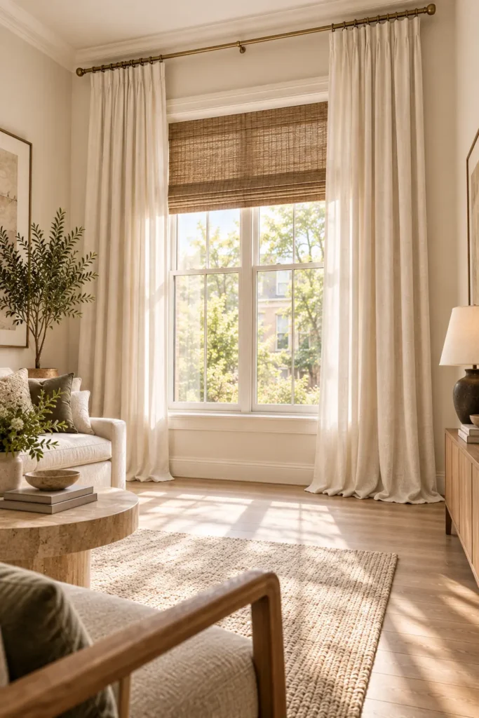
Windows have a surprisingly large influence on how expensive a room feels. Even beautiful furniture can look less polished when curtains stop above the floor, rods sit directly on top of the window frame, or narrow panels make the entire opening feel smaller than it really is.
Instead, treat the window as part of the room’s architecture.
Mount the curtain hardware as high as practical, ideally close to the ceiling line, and extend the rod beyond both sides of the window. Then use full-length panels that reach the floor. This creates long vertical lines that draw the eye upward and make the window, and often the entire room, feel larger.
Extending the curtains beyond the window frame also allows more of the glass to remain visible when the panels are open, helping preserve natural light.
The effect is subtle, but powerful. You’re not changing the size of the window; you’re changing how the eye reads its proportions.
Choose fabrics with enough weight to fall cleanly without looking stiff. Linen and linen-look panels work particularly well because their natural texture adds refinement while maintaining a relaxed appearance.
Frame Your Windows
- Extra-long Belgian linen drapery panels: create continuous floor-to-ceiling vertical lines with relaxed natural texture.
- Adjustable extra-long brass curtain rod: allows the hardware to extend beyond the window and sit higher on the wall.
- Solid brass curtain rings: add a small, substantial hardware detail that makes the installation feel more considered.
- Woven bamboo Roman shades: provide an alternative window layer when full drapery isn’t practical while introducing natural texture.
Create Negative Space with Floating Furniture
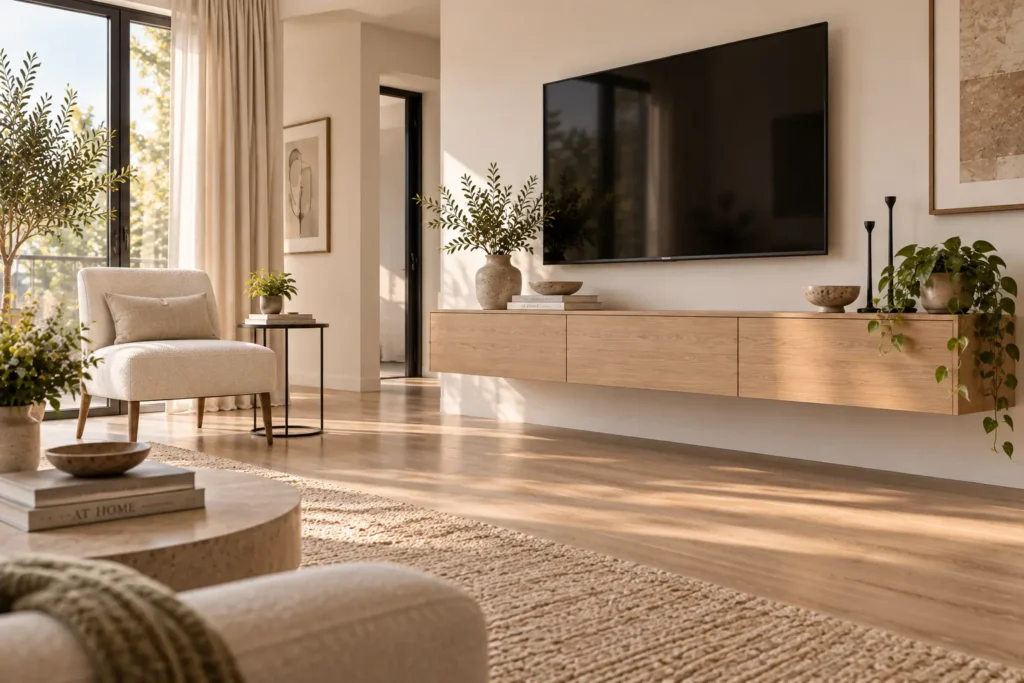
One of the simplest ways to make a small home feel more spacious is to show more of the floor beneath and around your furniture.
When every piece sits directly against a wall or rests on a solid base, the room can feel visually heavy. The floor disappears beneath a continuous line of furniture, making the footprint seem more crowded than it actually is.
Instead, introduce pieces that allow the eye to travel underneath them. A wall-mounted media console, floating bedside shelf, slim-legged side table, or chair with exposed legs creates small pockets of visible floor. Those gaps may seem insignificant individually, but together they make the entire room feel lighter.
This doesn’t mean every piece needs to float. In fact, too many suspended or extremely lightweight pieces can make a room feel disconnected. The goal is to balance substantial furniture with enough visible floor to preserve a sense of openness.
Whenever possible, also avoid blocking the natural circulation path. Furniture should define the room without creating unnecessary obstacles through it.
Create Visual Lightness
- Floating media shelf: keeps storage off the floor and creates an uninterrupted visual line beneath it.
- Wall-mounted bedside shelf: provides a useful surface while preserving floor space around the bed.
- Slim-legged side table: adds function without creating another visually solid block.
- Armless accent chair with exposed legs: provides seating while allowing light and sightlines to pass underneath.
BRING MORE GOOD IDEAS HOME
A little inspiration, delivered regularly.
Get thoughtful decorating ideas, practical home tips, and fresh inspiration in your inbox.
Weekly Inspiration. No Spam
Multiply Architectural Depth with Strategic Mirrors
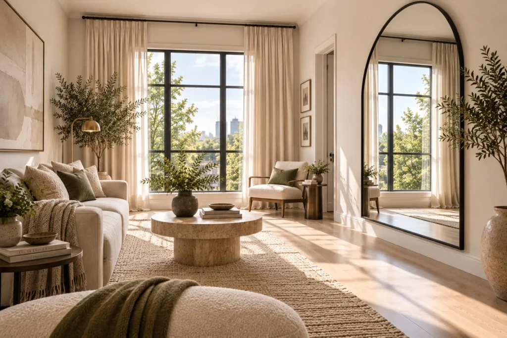
A mirror can do much more than provide a place to check your reflection. In a small home, its most valuable function is extending the visual field.
The biggest mistake is hanging a mirror simply because you have an empty wall. Placement matters far more than the mirror itself.
Position a large mirror where it can reflect a window, a bright doorway, or a carefully illuminated part of the room. This allows it to bounce light deeper into the space while creating the visual impression that the room continues beyond the wall.
An oversized mirror is often more effective than several small ones. A large uninterrupted reflective surface creates a stronger sense of depth and introduces fewer visual divisions.
You can also use an arched or softly shaped mirror to create an architectural focal point, particularly when the surrounding furniture has predominantly straight lines.
The objective isn’t to make the room look like it’s covered in mirrors. It’s to create one convincing visual extension that makes the architecture feel deeper and brighter.
Multiply Light and Depth
- Oversized arched wall mirror: creates a strong vertical focal point while visually extending the room.
- Minimalist full-length floor mirror: adds depth from floor to ceiling and works especially well in compact bedrooms or dressing areas.
- Beveled-edge landscape mirror: creates a broad reflective surface that can bounce light across a small room.
- Polished brass vanity mirror: combines reflective function with a refined metallic accent.
Introduce Material Drenching with Cold, Heavy Stones
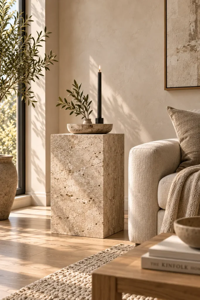
Luxury is often communicated through material presence rather than decoration. In a small home, you don’t need stone covering every surface to create that impression. A few substantial pieces can be enough.
Travertine, marble, limestone, and other natural stones have an inherent visual weight that immediately makes a space feel more considered. Their veining, pores, tonal variation, and solid appearance create depth that lightweight synthetic accessories often struggle to reproduce.
The key is to use these materials selectively. A travertine pedestal beside a sofa, a stone tray on a console, or a marble surface on a small side table can introduce a sense of permanence without overwhelming a compact room.
You also don’t need to use the most expensive stone available. Honed and naturally varied finishes often look more sophisticated than highly glossy surfaces, particularly when paired with simple furniture and restrained colours.
Think of stone as an architectural accent rather than another layer of decoration. One substantial piece can often do the work of several smaller accessories.
Introduce Substantial Stone
- Honed travertine pedestal: adds architectural weight and natural variation to an otherwise quiet corner.
- Travertine decorative tray: introduces authentic stone texture without requiring a major furniture investment.
- Polished stone candle holder: brings a small touch of substantial material to a tabletop.
- Veined marble side table: creates a refined focal point through natural veining and solid visual weight.
Elevate Daily Touchpoints with High-Contrast Hardware
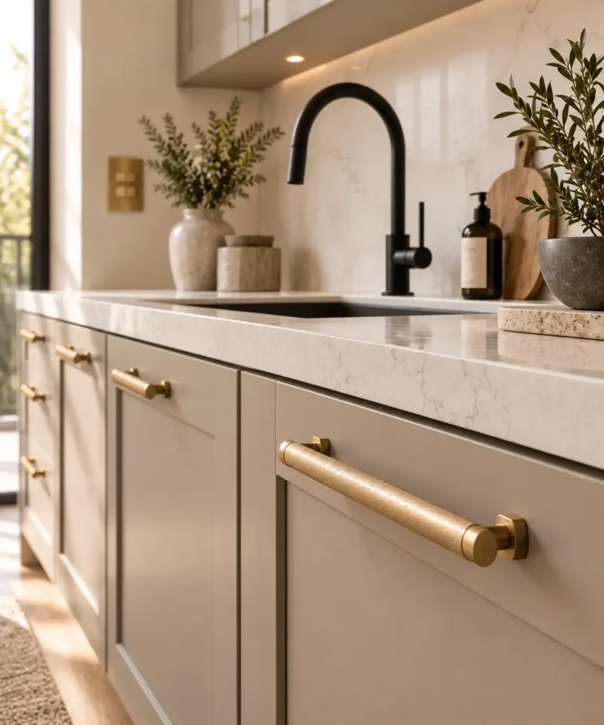
Some of the details that make a home feel expensive are the ones you interact with every day.
Cabinet pulls, door handles, faucets, towel hardware, and switch plates may seem insignificant individually, but they occupy highly visible positions throughout a home. When these details look inexpensive or inconsistent, they can make an otherwise beautiful room feel unfinished.
This is where a simple high-low design strategy can make a noticeable difference. Keep the larger pieces of your home practical and within your budget, then spend selectively on the details that people see and touch constantly.
Choose one dominant metal finish and repeat it where appropriate. Brushed brass can bring warmth to a neutral kitchen, while matte black can create sharper contrast against lighter cabinetry. Satin or brushed finishes are often easier to integrate than highly reflective finishes because they add presence without becoming overly flashy.
The goal isn’t to make every fixture look luxurious individually. It’s to make the small details feel intentional, substantial, and connected.
Upgrade the Details
- Brushed-brass cabinet pulls: replace basic hardware with a more substantial finish that immediately changes the feel of cabinetry.
- Matte-black kitchen faucet: creates a strong architectural detail against light or neutral surfaces.
- Modern solid-metal door lever set: gives frequently touched doors a more considered finish.
- Brushed-brass switch plates: turn an overlooked functional detail into part of the home’s visual language.
Conclusion
A small home doesn’t need an enormous budget or a complete renovation to feel expensive.
The most convincing transformations usually come from a handful of deliberate decisions: connect the rooms with a consistent colour language, use scale confidently, stretch windows toward the ceiling, expose more floor beneath furniture, and use mirrors to create depth. Then introduce a few substantial natural materials and upgrade the everyday hardware that quietly reveals the quality of the space.
None of these tricks requires filling the home with expensive things. In fact, the opposite is often true.
Luxury is created through intention, proportion, continuity, and restraint, not volume.
When every visible detail feels considered and every major element has a clear purpose, even a compact home can feel polished, architectural, and remarkably expensive.
RELATED ARTICLES